A first look at DxO PhotoLab 3.1
I was recently offered a copy of DxO PhotoLab 3 to try out for a review.
I have always been an Adobe girl and use Lightroom Classic and Photoshop exclusively — well, that’s because that’s what everyone was using. I am not normally one to follow the pack, but once I was in, I wasn’t really feeling the need to get out. This is not my first dance with Nik Effects Pro, which is another added benefit with DxO products, but I’ll save that for later.
DxO PhotoLab is non-destructive and makes a new DOP file with all corrections and filters, so it is really no different in that regard to Lightroom. So what does it offer? Well to start with — price. If you are just after the basics of PhotoLab, it’s only $129 (You can get Nik and PhotoLab 2 for $149.00). There’s also no Subscription.
A first look
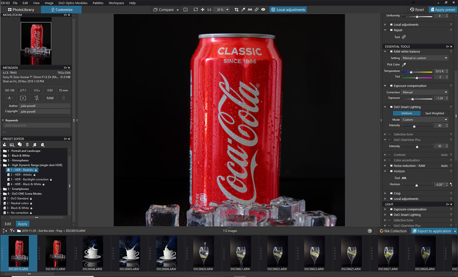
Once installed I opened the start screen and had to pause. “We were not in Kansas anymore Toto.” There are two tabs on the left, one was PhotoLibrary and the other Customize.
Once installed I opened the start screen and had to pause. “We were not in Kansas anymore Toto.” There are two tabs on the left, one was PhotoLibrary and the other Customize.
I could search for images by day rating and more, or I could search through my PC for folders. It did not automatically try and download from an SD Card, something I do NOT like doing anyway. Selecting folders via a folder was easy and they were available straight away. No waiting for images to be installed and converted to DNG. I could get to work straight away … I LOVE that.
Another thing that impressed me right off the bat, PhotoLab immediately recognized what camera I was using and which lenses I had and asked if I wanted to import those optic modules. This is great for making sure that the correct lens distortions are accounted for. OK — so far so good.
Customizing your photos
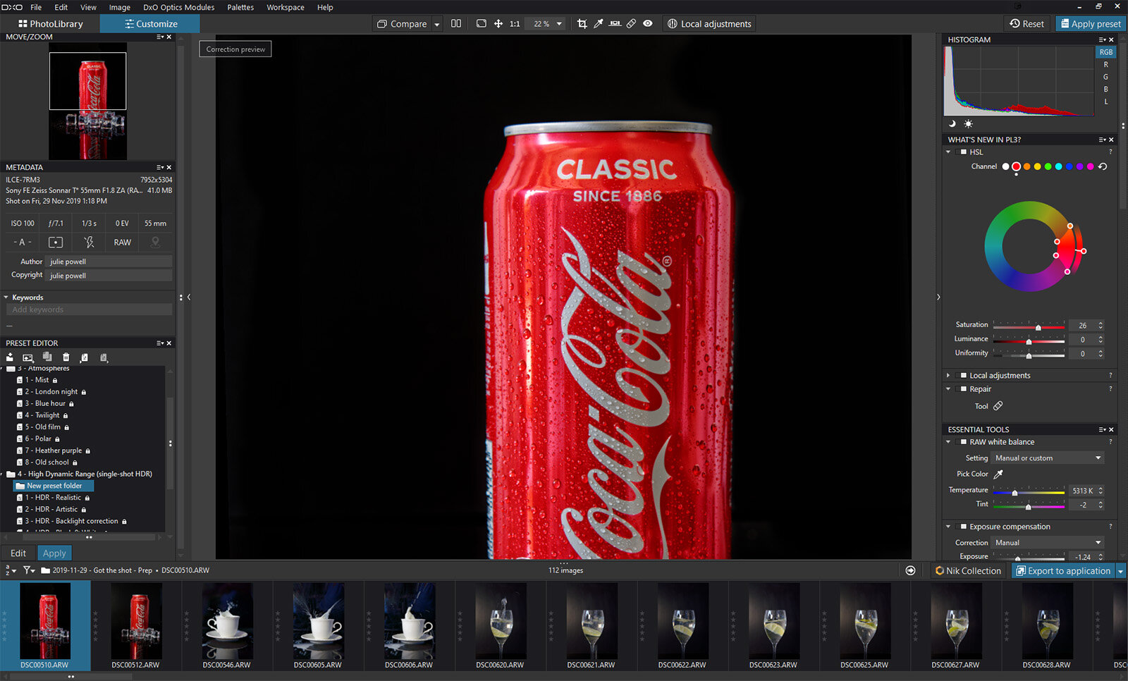
My next step was clicking on the Customize tab. The Customize tab is where the magic happens. All the meta is on the left — you can add keywords just below that, quickly and easily. The usual suspects are on the right, with the Histogram (apparently not editable), the “What’s New in PhotoLab 3?” panel (which I’ll circle back to).
Essential tools and more
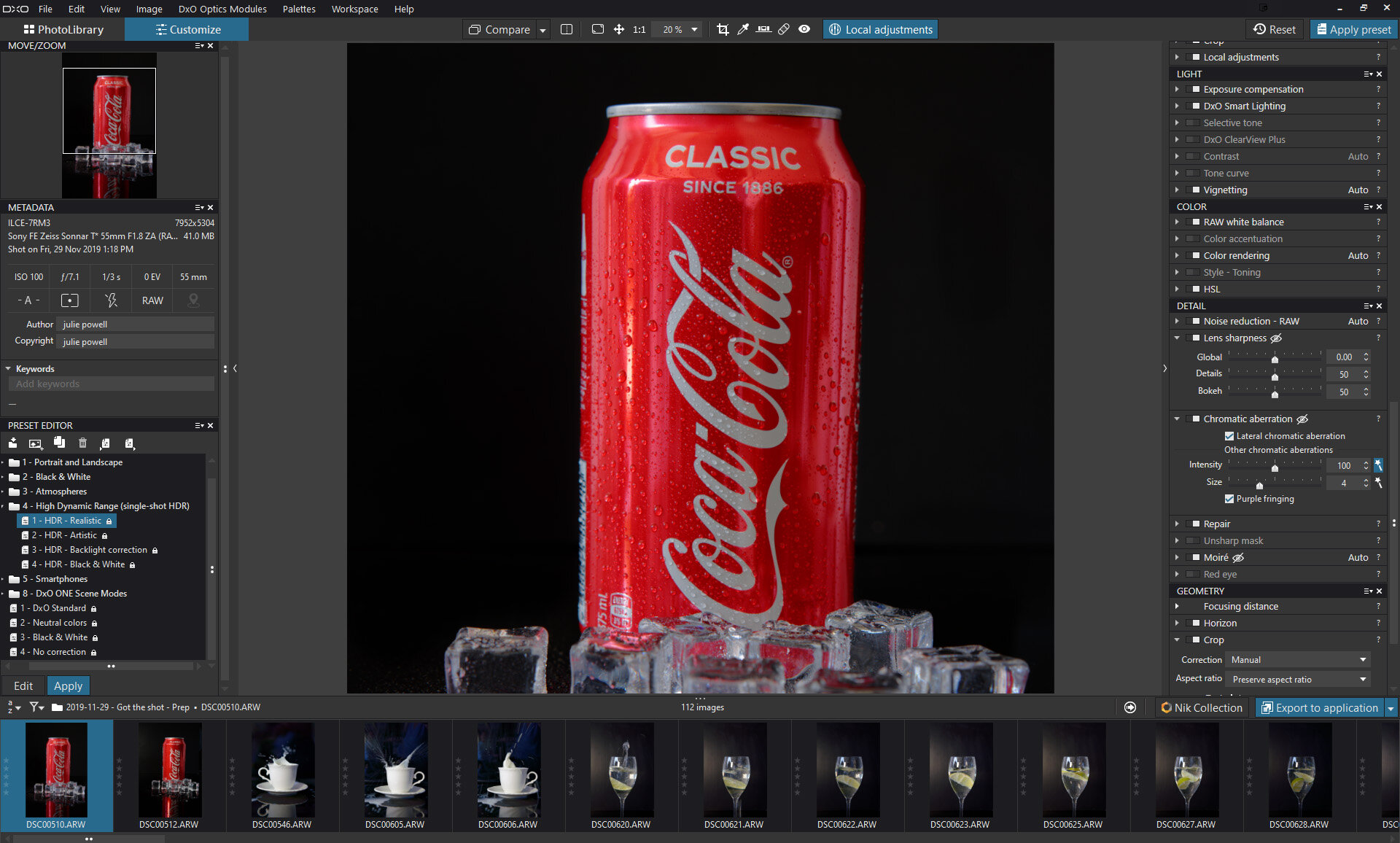
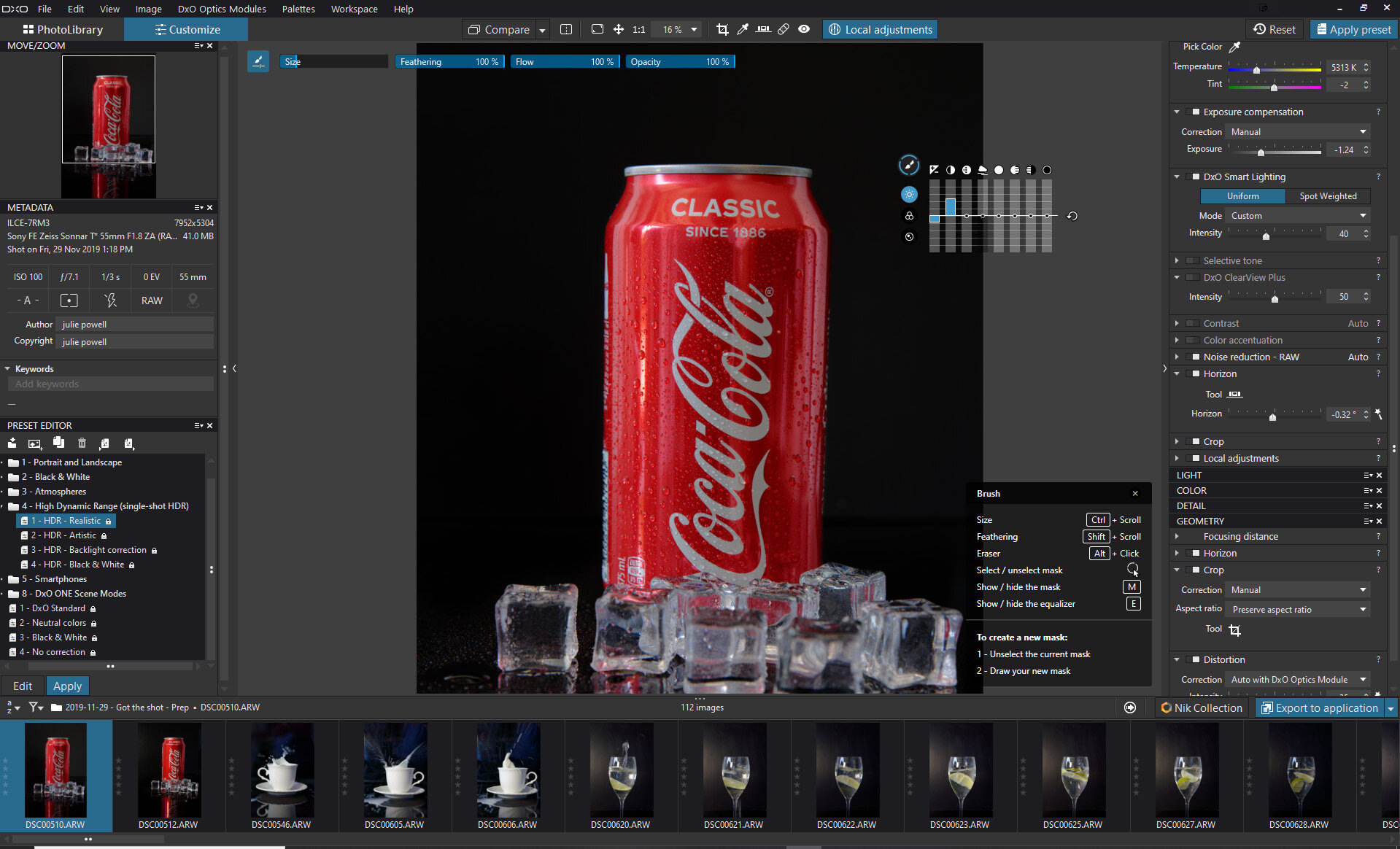
Still making my way down is Essential tools, which includes White Balance, Temperature and Tint, Exposure Compensation, Contrast and DxO Smart Lighting (still working on that), Noise Reduction, a straightening (Horizon) tool and Crop. I could not crop beyond the constraints of the original image, so Photoshop wins that round.
I must admit it took a bit to get an image vertically straight, but the horizontal straight was quick and easy. The DxO ClearView Plus acts a bit like Lightroom’s Dehaze slider but seems a little more intuitive, and I loved the Microcontrast in the Contrast panel.
Next are the Light, Color, Details and Geometry Panels. Note that some items appear to be listed in more than one place.
Filmstrip
Down the bottom of the screen is the Filmstrip. Nothing new here — hover over the images and the full EXIF metadata is displayed. Images can be given a star rating here too. Just above the filmstrip on the left is the Preset Editor, which is where things start to look a little familiar. There are some presets loaded, and you can create new ones too.
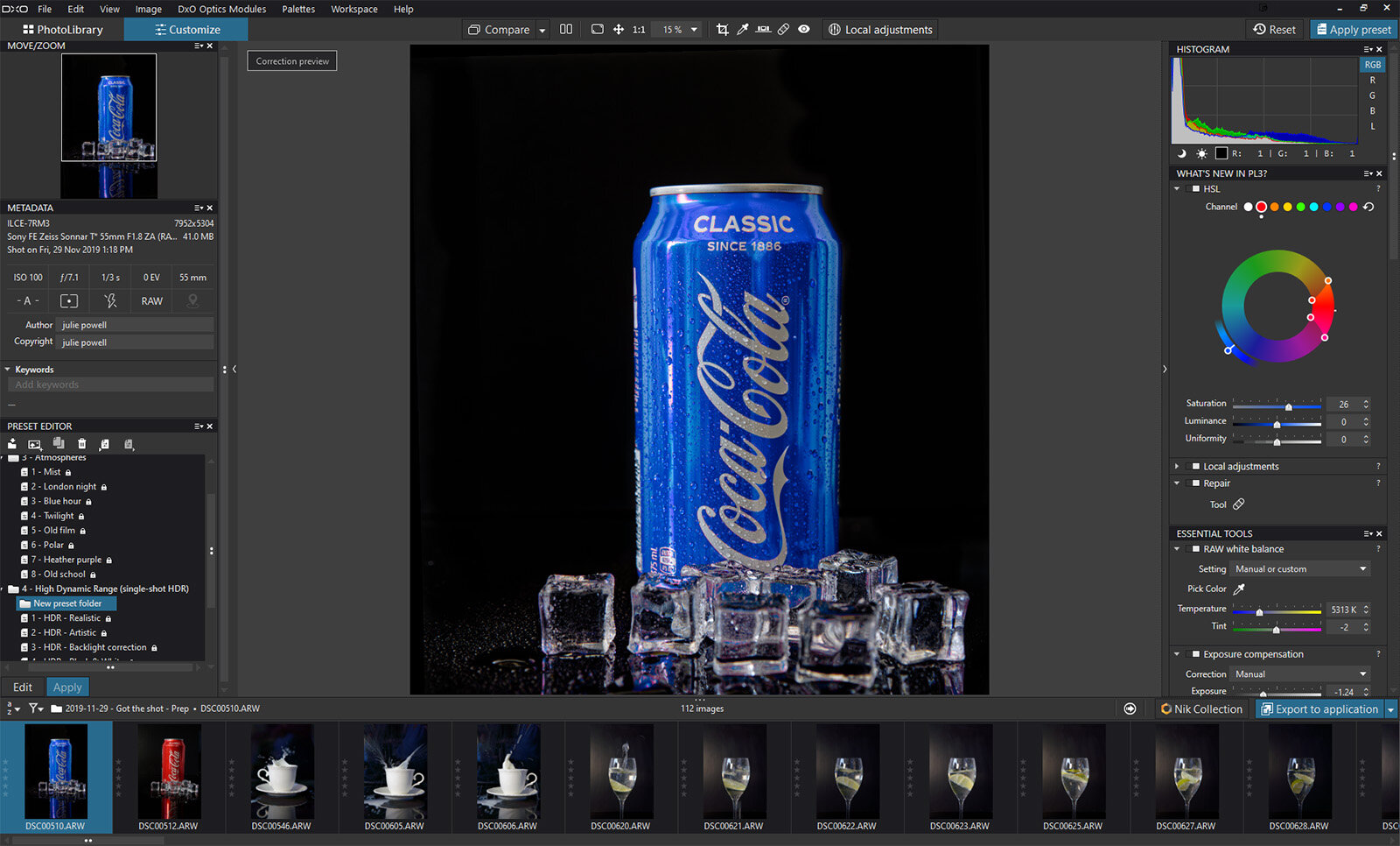
What’s New in PL3? panel
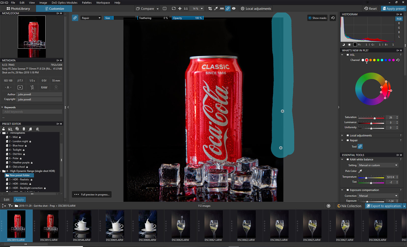
I have not used PhotoLab 2, but the features in the What’s New in PL3? panel were pretty cool. I really enjoyed playing with this panel. After reading some great things about this HSL panel, I quickly found it to be fantastic, intuitive and loads of fun to play with. The Repair panel was also easy to use.
So many features are quite intuitive, like making the image smaller or zooming in (Ctrl – or + on PC, Cmd – or + on Mac) and the Undo command (Ctrl Z on PC, Cmd Z on Mac).
What won my heart?
Apart from the HSL panel which was SO MUCH FUN, the Local Adjustments is the winner. Granted it took a minute to figure out, but then I think I fell in love.
Everything is right there on the screen — there’s no need to select or mask and then look for adjustment panels. There is even a panel that pops up to remind you what buttons do what. This is handy when you are familiarizing yourself with a new program.
What’s the catch?
Most commands are mouse-driven, Control and Scroll for example. So if you ONLY use a graphics tablet, you may find this constraining. You can still use a pen and tablet, and use the on-screen controls, but it felt a little clunky and far more intuitive to use the mouse. I know this will be a turn off for some people. I am somewhat ambidextrous between a tablet and a mouse and will happily switch from one to another.
So what’s next for my DxO PhotoLab 3 experiment? Still life and product photography was a win; next I am off to explore some portraits and landscapes, perhaps have a look at some more presets and then dive deep into the Nik Collection.
Read More…
